
Using seamless patterns in product packaging
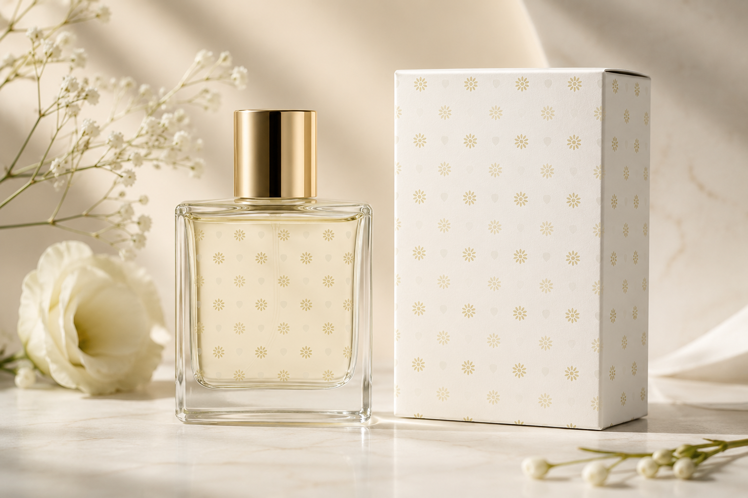
Packaging is the first thing a customer touches, and a repeating pattern is one of the cheapest ways to make it feel considered. For a small maker or an online shop, a signature pattern turns plain boxes and mailers into an experience people remember and photograph.
Where a pattern earns its keep
You rarely need to print a full illustration to lift packaging. A well-judged repeat does the work across almost every surface a product touches:
- Boxes and cartons, wrapped inside or out for a premium unboxing.
- Tissue paper and mailer inserts, where a soft repeat adds a moment of delight.
- Labels, stickers and tape, small surfaces that suit a tight, dense pattern.
- Bags, wrap and void fill, which tie the whole parcel together.
Where to spend first
Custom printed boxes carry high minimum orders, and for most small businesses they are the wrong place to start. The cheapest way to make packaging feel designed is to leave the box plain and put your pattern on the things that cost very little: printed tissue paper, a sticker or seal, and a strip of paper tape. Those three items are inexpensive, they need no die lines or structural artwork, and together they transform the moment a parcel is opened.
Once a pattern is earning its keep on the small items, moving it onto printed mailers or cartons later is straightforward, because the artwork already exists and the look is already familiar to your customers.
Design for recognition
Packaging patterns work hardest when they are unmistakably yours. Pull your motifs and palette from your existing brand: the colours of your logo, a shape that echoes what you sell, a repeated icon that becomes a signature. Consistency is what makes a pattern read as a brand rather than as decoration, so use the same one across every touchpoint.
Keep it subtle and let it scale
Packaging is folded, cut and viewed at odd angles, so a small, even repeat is more forgiving than a few large motifs that could land awkwardly on a seam. A quieter, tonal pattern also lets your logo and product details stay the star. If in doubt, lean understated: elegant beats loud on a box.
Folds, seams and the parts nobody plans for
A flat design becomes a three dimensional object, and that changes things in ways a screen preview will not show you. A box has creases that crush the artwork slightly, glued seams where the pattern runs under an overlap, and flaps that get tucked out of sight. Tissue paper gets scrunched, so only a fraction of the sheet is ever visible at once.
All of this argues for an even repeat rather than a carefully composed layout. If your design depends on a particular motif sitting in a particular place, packaging will defeat it. A pattern that looks the same wherever you cut it survives folding, wrapping and scrunching without any planning at all, which is precisely why repeats are so well suited to this job.
Printing methods and what they mean for your design
You do not need to become a print expert, but knowing roughly how your packaging will be produced will save you a reprint.
- Digital printing handles full colour and fine detail happily, and suits short runs. This is what most print on demand packaging services use, and it puts the fewest constraints on your design.
- Spot colour printing, common for tape, tissue and larger carton runs, prints a fixed number of solid inks. It is cost effective at volume, but the price often rises with each additional colour, so a one or two colour pattern is worth designing deliberately.
- Kraft and unbleached stock is not white, and ink is not opaque. Pale colours will sink into the brown board and light motifs may nearly vanish. Design for kraft by using stronger, warmer tones, or by choosing a single dark ink and letting the board itself be your background colour.
Ink coverage, cost and waste
Heavy ink coverage costs more, takes longer to dry, and can complicate recycling on some materials. It is also, more often than not, the less attractive option. A pattern with generous negative space tends to look more considered than one printed edge to edge in solid colour, and it will usually be cheaper to produce. If you are weighing two versions of a design, the lighter one is frequently the better answer on both counts.
Getting print-ready files
- Design the tile in the editor and check it in the live repeat.
- Export a high-resolution PNG, or the SVG if your printer accepts vector files, at a generous size.
- Send it to your packaging printer or print-on-demand service, and confirm their preferred format, resolution and bleed.
- Order a sample and check the colour and scale on the real material before a full run.
Our guide on designing for print covers resolution and scale in more depth, and the same principles apply to card and paper.
Keep reading: Branding with a signature pattern · Design your own wrapping paper · Patterns for fabric & apparel