
Seamless backgrounds for websites, apps and social media
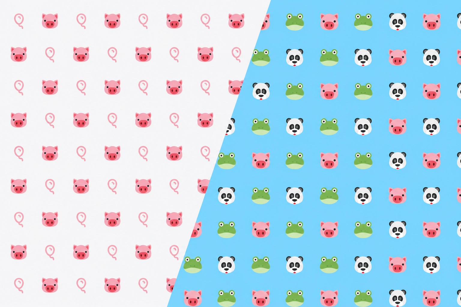
Not every pattern is destined for print. A subtle repeating background can lift a website, an app screen or a social media post without any of the weight of a full illustration. Because a seamless tile repeats forever from a tiny file, it is one of the most efficient design assets you can make.
Why tileable is the whole point
On the web, a background is usually a small image that the browser repeats to fill the screen. If that image tiles seamlessly, the surface looks like one continuous texture at any size, on any device, while only a few kilobytes travel down the wire. A seamless pattern is built for exactly this, so what you export drops straight into a site or app as a repeating background.
Restraint is everything
A background has one job: to add texture without stealing attention from the content on top of it. The most common mistake is making it too loud. A few habits keep it tasteful:
- Low contrast. Keep the motifs close in tone to the background colour so text stays easy to read over the top.
- Small, even motifs. A fine, regular repeat reads as texture; big bold shapes compete with your content.
- Calm colours. Soft, desaturated tones sit behind an interface far more comfortably than bright ones.
Keep the text readable
A background sits underneath words, and that makes readability a requirement rather than a preference. Body text needs a contrast ratio of at least 4.5 to 1 against what is behind it to meet the widely used accessibility guidelines, and a patterned background makes that harder to judge, because the contrast now varies depending on which part of the repeat a letter happens to land on.
The safest approach is to keep the pattern and its background colour very close in tone, so the effective contrast barely changes across the tile. Where a design is too lively for that, put the text on a solid or semi transparent panel and let the pattern frame it instead. Test with your smallest text size rather than a heading, since that is where legibility fails first.
One tile, two themes
Exporting a transparent PNG turns a single tile into a background that works in both light and dark mode. Because only the motifs are drawn and the background stays empty, you can set the surface colour in CSS and let the same image sit on top of it:
.surface {
  background-color: #fbfcfd;
  background-image: url("pattern.png");
}
@media (prefers-color-scheme: dark) {
  .surface { background-color: #14262d; }
}
That covers a lot of cases with one file. If the motif colour itself needs to change between themes, export two colourways of the same tile instead and swap the image, which keeps the geometry identical so the two versions feel like one design.
Why a small tile is good for performance
A repeating tile is one of the few genuinely free wins in web design. A full width decorative image can run to hundreds of kilobytes and has to be produced at several sizes to serve different screens. A seamless tile is typically a few kilobytes, downloads once, is cached, and then covers a phone screen and an ultrawide monitor equally well because the browser does the repeating locally.
Two habits keep that advantage. Export the tile no larger than it needs to be, since a 1000 pixel tile is usually ample for a background and a 4000 pixel one is wasted weight. And prefer a simple geometric design if you are using SVG, because a tile crowded with intricate motifs produces a much larger file than a handful of clean shapes.
SVG or PNG for the web?
Both work, and each has a place:
- SVG is a vector, so it stays razor-sharp at any zoom and on high-resolution screens, usually from a very small file. It is ideal for clean geometric backgrounds.
- PNG is a reliable choice everywhere and handles softer, more detailed designs well. Export it just large enough for one tile to keep the file light.
If you are not sure which to use, our guide on SVG vs PNG breaks down the trade-offs.
Beyond the browser
The same seamless tile has plenty of digital uses beyond a webpage. It makes phone and desktop wallpapers, backdrops for social posts and story templates, section dividers in a slide deck, and headers for a newsletter. Design once, export at the size you need, and reuse it across every channel for a consistent look.
Keep reading: Branding with a signature pattern · Designing wallpaper patterns · SVG vs PNG